We’re celebrating 40 years in landscape design! Join us for a special garden design event in Charleston, SC…Come take YOUR garden to school!
The Design Principles : #6 Light and Shadow , #7 Proportion and Scale & #8 Reflection
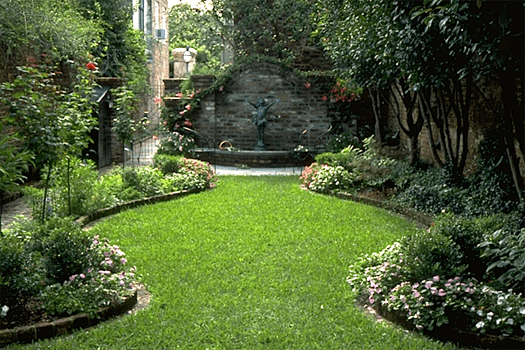
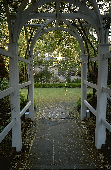
 6. Light and Shadow. Going along with color, light and shadow playing off one another has its own emotive language. Dappled light filtering onto a lawn or forest floor creates an ever-changing wash of patterns. An environment like this releases you from prosaic thoughts and evokes a feeling of serenity and inspiration. The animated light quality reduces the feeling of enclosure and encourages peaceful thought.
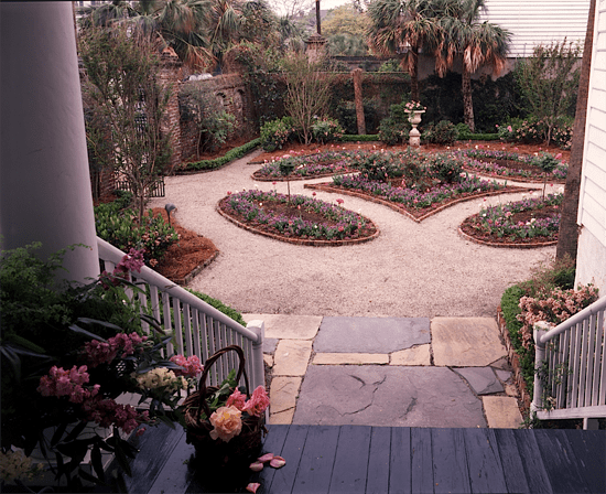
7. Proportion and Scale. Most of the western world’s greatest architectural achievements demonstrate a mastery of proportion (i.e., the relationship of parts to the whole). In architecture, proportion has been traditionally founded in the rigors of mathematics and geometry. This is why geniuses like Andrea Palladio in the Renaissance took the trouble to learn the numerical proportions of the Roman builders.
The more formal designs in landscape architecture also have their historical roots in classical proportions, although now they are rarely taught. For most landscape architects working on residential projects, determining proportion is largely a matter of sensing and intuiting, through training one’s eye, how to create harmonious spatial relationships between the parts of a design and the whole. If you study the most renowned sites and classic examples of architecture and landscape design, you will internalize a feeling for proportional relationships that look and feel right.
Scale relates a bit more to the size of elements in relationship to their context. Out of scale refers to an overly large object placed in a too-small setting. Under-scaled is a tiny object lost in an ocean of space like an acorn on a lawn. In general, we find that people tend to under-scale statuary and pots in relation to where they are being used. For those two categories of objects, we tend to advise, “When in doubt, select a more generous rather than a smaller size.” This is especially true of pots.
8. Reflection. When there is a possibility of using it, reflection adds depth and a sense of mystery to a scene. The reflection of light across water draws the eye and makes a space lively in the sunshine and soothing in the evening. Trees beside a pool seem taller and assume more importance. The effect of color is doubled.
The creative use of the tools of visual art lies in designing a visually stimulating landscape using the four art elements (line, color, form and texture) and the broader principles of design such as proportion, scale and focalization. By visiting notable landscapes, photographing, sketching and studying the plans, you will build a strong foundation for your design.
Join us in Charleston, February 25-27, 2013 as we share the recipes for these timeless outdoor rooms.
In honor of Dargan Landscape Architects 40th Anniversary in 2013, Elements of Outdoor Rooms, harkens to our early design practice in Charleston, SC. Full time for decades and continuing on today, we’ve tested art elements & client needs on the canvas of this historic city. Dargan archives at the South Carolina Historical Society house hundreds of our courtyard and outdoor room designs, many of which exist today and hold lifestyle tools useful to properties anywhere.
 3. Symmetry and Asymmetry. Chaos and order. Be it a house or landscape under construction, chaos results. Even the most ordered man-made landscape in picturesque or formal style goes through a learning curve involving earth moving and revegetation. A master landscape plan helps navigate the rough road to perfection. Look to Mother Nature for clues involving environmental concerns to make the ultimate landscape ordered by both man and natural processes.
 ns have a secret language. Their hidden underpinnings are design principles. This lexicon is critical to your success as a designer. With these words, you can describe why a garden visually works.
 arleston, SC where we cut our teeth on courtyard garden design and SEE what makes them tick! Join us February 25-27 for Create YOUR Outdoor Room, Courtyard or Garden Retreat & Live a Live you LOVE!